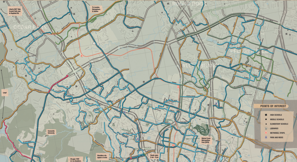
Will the bike path marked on the map provide a pleasant pedal on a neighborhood street? Or a harrowing odyssey along a major arterial, with cars whizzing by at high speed? Even the more nuanced maps rarely take the cyclist’s level of comfort as the basis for their markings, using instead a classification approach based on the somewhat obscure terminology used by planners and engineers.
The city of Austin is doing its best to remove the mystery by using a mapping system that gives riders a quick, color-coded visual overview of its bike network, all keyed to the real-world experience a person can expect when cycling on any given street. According to Nathan Wilkes, a project designer and network planner at the Austin public works department who specializes in bike infrastructure, the map is heavily influenced by the thinking of Roger Geller, the bicycle coordinator for the city of Portland Oregon, who developed an influential taxonomy of transportation cyclist types in his city.
Geller puts riders into four categories: 1 percent or less are "strong and fearless" and will ride under any conditions; 7 percent are "enthused and confident," and feel "comfortable sharing the roadway with automotive traffic, but … prefer to do so operating on their own facilities"; 33 percent are "no way no how"; and the remaining roughly 60 percent are "interested but concerned."
In other words, the majority of people might want to give biking for transport a try, but they’re worried they might not be able to handle the stress and danger of riding on their city’s roads. That 60 percent is the coveted demographic slice that Wilkes and others want to encourage. And for Austin, a better bike map is a key part of an overall strategy to get those folks out and riding.
The city’s map prioritizes rider comfort in its symbology. "We tried to make it real intuitive," says Wilkes, who has been refining the concept for several years now. Bike trails, separated cycle tracks, and what the city terms "quiet streets" – in peaceful, low-traffic neighborhoods – are marked in vivid green. "High comfort" roads are bright blue."Medium comfort" is marked in a darker blue. "Low comfort" is indicated by a cautionary yellow. And red signifies "extremely low comfort," as in, you probably don’t want to go there unless you are one of the rodeo-riding one percent. Directional arrows indicate hills and how steep they are.
The result is a map that shows at a glance where the riding is easy and where it’s more challenging. Because the colors are parallel to those used by traffic lights (with the addition of that peaceful-looking blue) they make a deep kind of sense to our eyes and brains.
The goal, says Wilkes, is to give people the information they need when they set out to ride without getting into the terminology that engineers use when they are designing bike lanes – Class I, Class II, buffered, separated, cycle track, and so forth – which is essentially meaningless to the layperson, but which forms the basis of color-coding on most urban bike maps.
“You don’t need to know what type of lane you’re on,” says Wilkes. What you need to know is whether the streets in question will feel appropriate for your particular comfort level – which might vary. The route you might want to ride on your way to work, in dark blue perhaps, won’t be the same as the green path you’d feel comfortable sharing with your 8-year-old.
One of the things Wilkes and his colleagues are trying to achieve with the map is to show just what is available that meets the very highest comfort level. “We want people to see, hey, look at all these places you can go even with your kids.” At the same time, the map is helpful to planners because it shows comfort gaps in the network so clearly – spaces where the green and blue bits need to be filled in.
Austin is part of the Green Lane Project, which I wrote about earlier this week, and Wilkes posted on the group’s blog about the comfort maps. Here’s part of what he wrote there:
The hurdle in switching to this methodology is convincing committed riders who are well-versed in the language of bicycle infrastructure that the quality of the experience is more significant to most people than the configuration of paint and curbs on the roadway. A narrow bicycle lane on a busy high-speed street with heavy truck traffic can be a world apart from a wide bicycle lane on calmer street, yet both appear equal on a traditional bike map. In the end, map makers have to answer the question of who their target audience is and what information they need.In Austin, they are targeting the people who don’t care about engineering classifications, and are simply looking for an honest assessment of just how comfortable they will be when they get out on the road. You could call that audience the 99 percent.

No comments:
Post a Comment